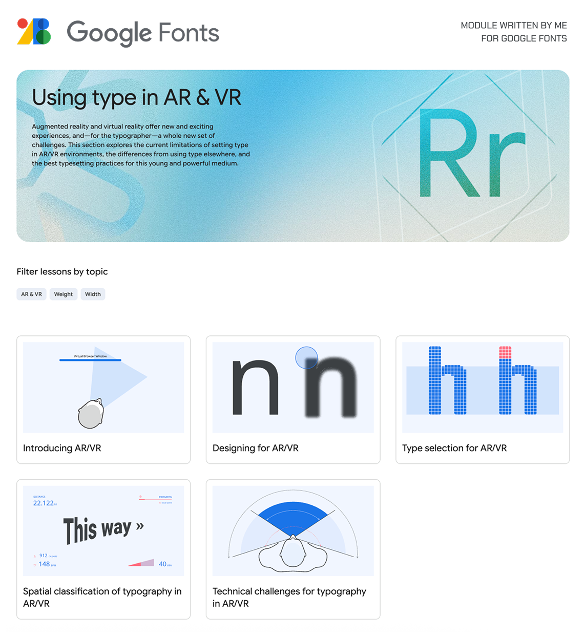
The research project started as a question: could we design typefaces that feel natural on AR headsets? Soon, the scope widened. Reading in space is not just about glyphs and pixels; it’s about posture, movement, light, and attention. It’s about interfaces that adapt to context, not just screens that float in front of us.
Current design guidance doesn’t yet account for these spatial variables. So this research looks closer: what truly supports reading in AR, and how might future interfaces learn from it?
This is independent research, built with care and sustained investment. If you find it valuable, your support will help it grow.
This was among the first outcomes of my AR/VR typography exploration. It began at the University of Reading, UK, as part of my MA in Typeface Design, and has continued to evolve since.
Articles
Since 2017, I’ve been regularly writing and publishing short articles from this research to ease entry into the field and lower the barrier for newcomers. Feel free to explore these to understand the core concepts.
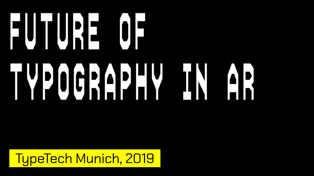
I speak at conferences and design forums around the world, sharing ongoing research in typography, spatial computing, and the future of reading. I also teach at universities, with a simple belief: students will shape what comes next. Have a look at past talks and online events, and if you’d like me to speak at your event, feel free to get in touch
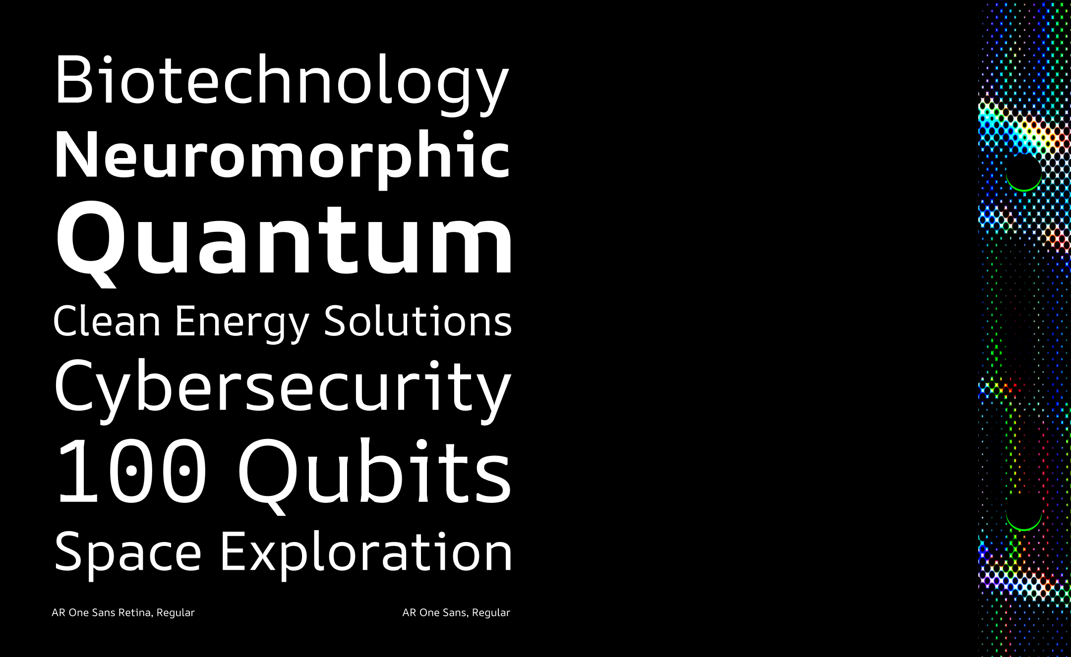
AR ONE SANS
AR One Sans is built for augmented reality and UI. Low contrast, generous spacing, and sturdy forms maintain readability against busy backgrounds. The family is grounded in research and testing across devices, from high-end headsets to low‑resolution devices, with optical weights duplexed to prevent reflow for a seamless cross‑platform experience. It supports comfortable reading even at longer lengths.
Reach out
If you’d like to discuss spatial typography, invite me to speak, or explore a project together, leave a note with a brief context. I’ll respond shortly.