HELLO//

I’m Niteesh, a design leader, independent researcher and a pioneering voice in the future of reading experiences. I work at the intersection of HCI, typography, spatial computing and culture. Reimagining how we read, interact, and communicate, whether through AR glasses or traditional mediums.

QUICK OVERVIEW//

  • Director of Design & Research at Pocket FM, leading design across global product divisions.
  • Exploring new paradigms in reading across AR/VR and AI-integrated interfaces
  • Designed AR One Sans, the first open-source typeface for AR, now on Google Fonts
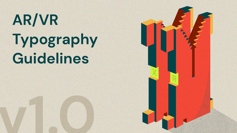
  • Authored the XR Typography Guidelines, shaping industry standards in immersive design
  • Previously spearheaded Future of Work initiatives at Meta and worked on projects with Google, Snapchat, Adobe…

LATEST FROM THE JOURNAL//

At the Heart of My Work//

⌘ Learn from the past to design for the future

Talks & events//

Typography as a Living Medium
ATypI 2025, Copenhagen, Denmark

Beyond Screens: Reimagining Typography in Immersive Realities
Automatic Type Design 3, Nancy, France

Multi-script Typography for digital products
UX Now, New Delhi, India

Spatial Typography: The World Beyond…
Face/Interface, Stanford University, US

An Immersive Exploration of Typography’s Modern Frontier
The Virtual Imperative, London, UK

Typography in AR
Central Academy of Fine Arts, Beijing, China

I speak at major global conferences and design forums, sharing insights on typography, spatial computing, product design and the future of reading. I also engage in lectures and workshops at universities worldwide, connecting with students and emerging designers. For talk or lecture enquiries, feel free to get in touch I’m always open to meaningful collaborations and conversations.

Before After
COMPARE ↓

Typeface family for AR glasses

AR One Sans is a typeface family designed for augmented and virtual reality headsets.
Crafted for clarity in complex environments, it features generous spacing, low contrast, and sturdy forms for optimal readability. Developed through extensive research and testing, it includes optical weights tailored for both high-end headsets and low-resolution devices—ensuring seamless, reflow-free reading across platforms.

Kind Words

New concepts need clear explanations. Mixed reality is upon us, and these guidelines from Niteesh make plain some of the key challenges that lay ahead for text — from technical details to reading experiences.

Tim Brown

Head of Typography, Adobe

Niteesh Yadav’s 4 part series on typography for AR is now the standard on the topic.

John Lax

VP Design, Reality Labs, Meta
Seprator

The new 2025 site is a work in progress. Please excuse me for the glitches!