//Hello
I’m Niteesh, a design leader, independent researcher and a pioneering voice in the future of reading experiences.
I work at the intersection of HCI, typography, spatial computing and culture. Reimagining how we read, interact and communicate, whether through augmented reality glasses or traditional mediums.
//Overview
- Leading global design as Director of Design and Research across Pocket FM’s product portfolio, including FM, Novels, Toons, and TV.
- Authored the XR Typography Guidelines, shaping industry standards in AR/VR design, now part of Google Font Knowledge base.
- Designed AR One Sans, the first open-source typeface for AR, available on Google Fonts
- Earlier, worked on several initiatives, including Future of Work at Meta.
- Led UX and brand design at Headout, scaling products for global audiences, bridging India-to-world strategies.
- Previously worked on projects with companies like Google, Snapchat, Adobe, Sony Music, Tata…
//01
Talks and Events
I’ve had the privilege of sharing my work at global conferences and design forums, speaking on typography, spatial computing, product design and the future of reading. I also enjoy giving lectures and running workshops at universities around the world, learning alongside students and emerging designers. If you’re interested in a talk or collaboration, feel free to reach out. I’m always open to meaningful conversations.
Typography as a Living Medium
ATypI 2025, Copenhagen, Denmark
Beyond Screens: Reimagining Typography in Immersive Realities
Automatic Type Design 3, Nancy, France
Multi-script Typography for digital products
UX Now, New Delhi, India
Spatial Typography: The World Beyond…
Face/Interface, Stanford University, US
An Immersive Exploration of Typography’s Modern Frontier
The Virtual Imperative, London, UK
Typography in AR
Central Academy of Fine Arts, Beijing, China


//02
Typeface for AR
AR One Sans is a typeface family designed for augmented and virtual reality headsets. Crafted for clarity in complex environments, it features generous spacing, low contrast, and sturdy forms for optimal readability. Developed through extensive research and testing, it includes optical weights tailored for both high-end headsets and low-resolution devices, ensuring seamless, reflow-free reading across platforms.
//AR One Sans Teaser | AR One Project
//Released in 2023
//03
Journal
KIND WORDS
Niteesh Yadav’s 4 part series on typography for AR is now the standard on the topic.
John Lax
VP Design, Reality Labs, Meta
New concepts need clear explanations. Mixed reality is upon us, and these guidelines from Niteesh make plain some of the key challenges that lay ahead for text — from technical details to reading experiences.
Tim Brown
Head of Typography, Adobe
//Why I Design
Design with Intent
Design is not about decoration. It’s about asking the right questions, making things clearer and shaping what comes next. But aesthetics matter. Because how something feels is often how it’s understood. Beauty isn’t the opposite of function, it’s part of it.
I design to make sense of complexity.
Sometimes that’s through a single letterform. Sometimes it’s a multisensory system. But always, it starts with care, for people, for the context they live in and for futures we don’t often pause to imagine.
Typography has always grounded me.
It shows how the smallest forms can carry the heaviest ideas. Whether in AR or VR, across scripts that flow left, right, or in spirals, type is how we connect. It’s not just how we read, it’s how we relate.
I’m not here to follow trends.
I’d rather dig deeper. To challenge lazy defaults. To question what’s considered ‘good enough.’ To build for those often ignored, new internet users, people with disabilities, readers across languages and scripts. Each project is a chance to shift the centre.
I see technology as a tool, not the goal.
AI, sensors, variable fonts, voice interfaces, they’re powerful. But only when used with purpose. My focus is on design that listens. That adapts. That responds to how you move, where you are and what you need.
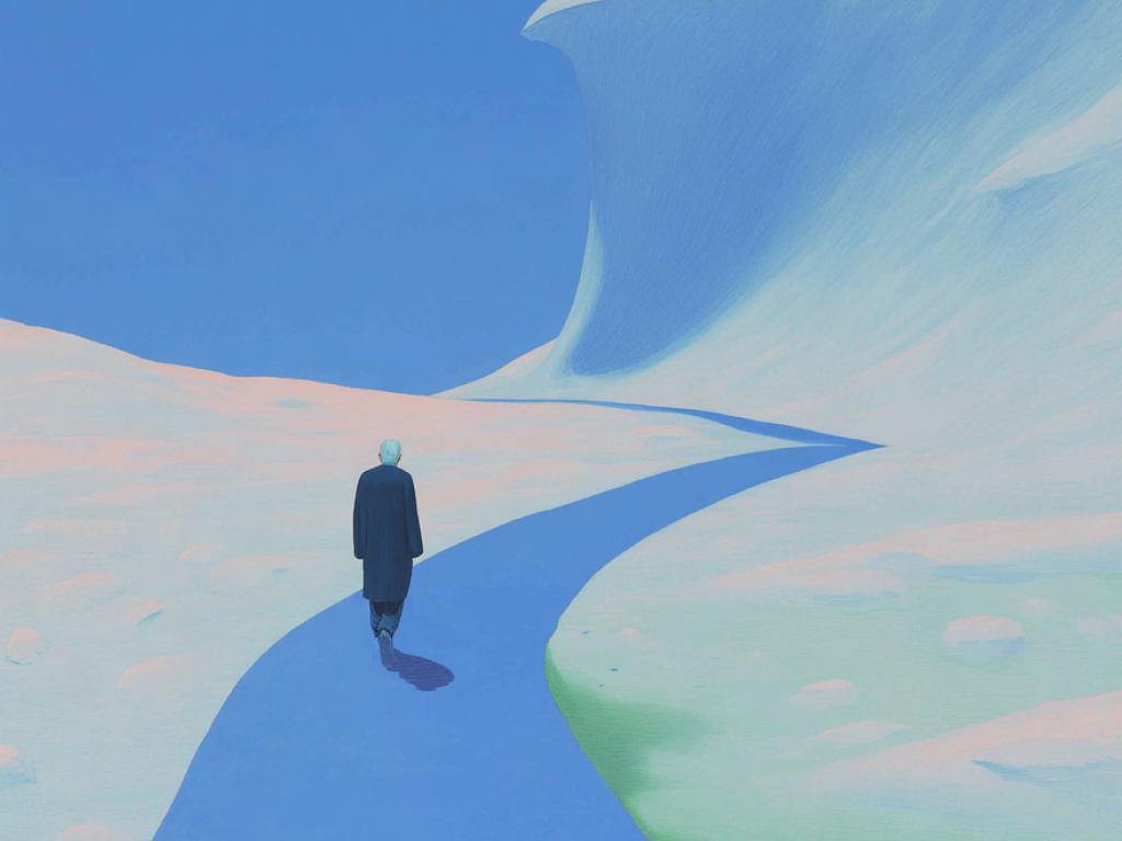
I’m drawn to thoughtful friction.
In a world racing ahead, I look for pause. Not to slow down for the sake of it, but to notice. To ask better questions. To do things with more respect.
Good design is generous.
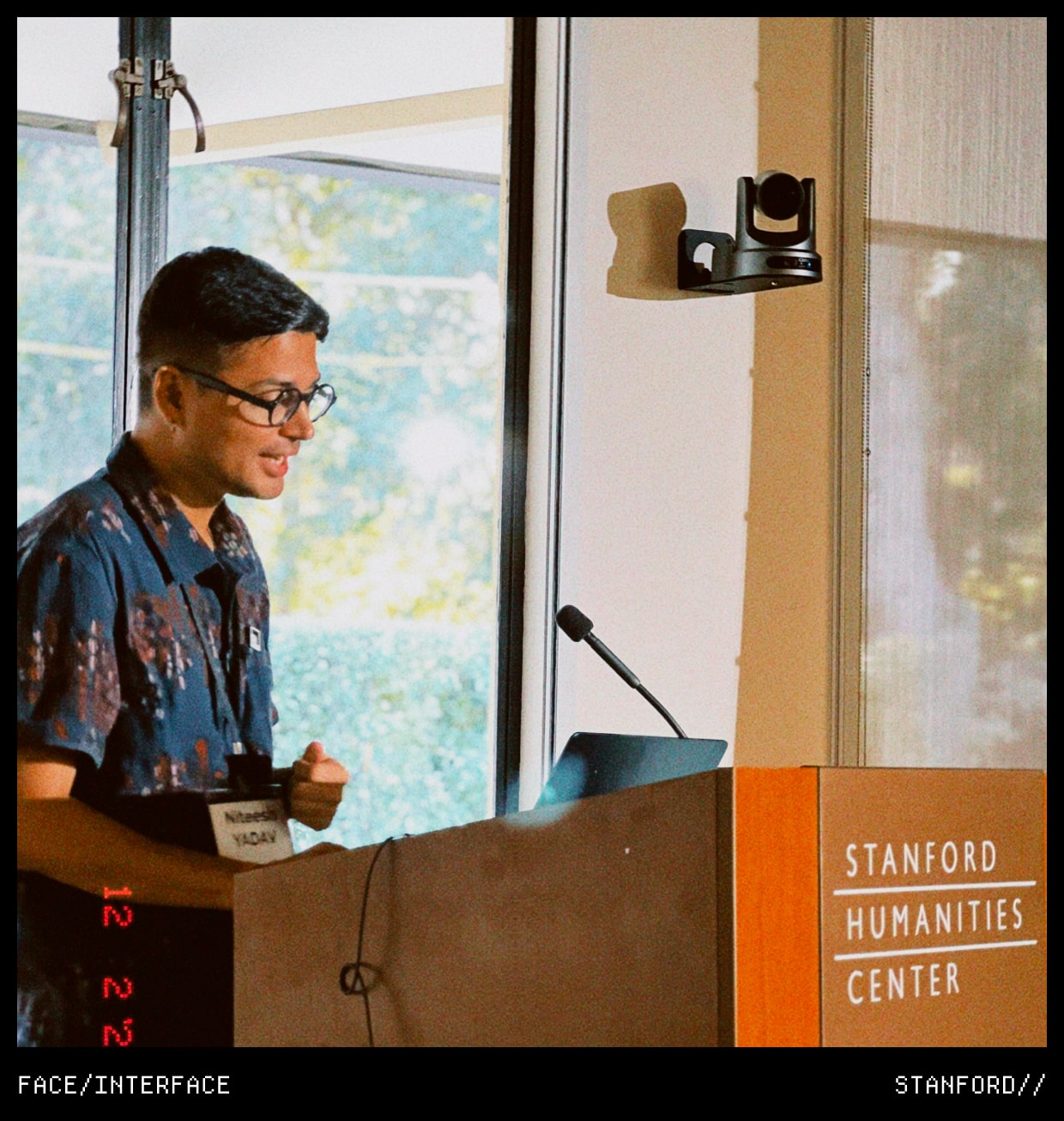
It invites collaboration, gives credit, welcomes critique. Whether mentoring new designers or working closely with engineers and researchers, I care about the process as much as the outcome.
My practice runs on rhythm, not hustle.
Morning walks, thinking time, real conversations. I’ve learned that meaningful design doesn’t come from burning out, it comes from being present.
And underneath it all is a quiet commitment to the path I’ve chosen
To use design with purpose, to stay useful, to shape what people read, hear, touch and feel with clarity, care and intent.
This is my way of being, not just working.