Designing for AR and VR is nothing like designing for the flat screens we’ve grown used to. Text doesn’t stay crisp, environments shift and distract, and what looks perfect on a retina laptop display can quickly break down inside a headset.
That’s why I created AR One Sans.
I spent time testing type across a messy range of devices, from high-end headsets to low-resolution smartphones, to see how letterforms behave in real-world conditions. The goal was simple: build a typeface that performs in the situations people actually encounter, not just in polished demo environments.
Why AR One Sans feels different
Shapes built for clarity
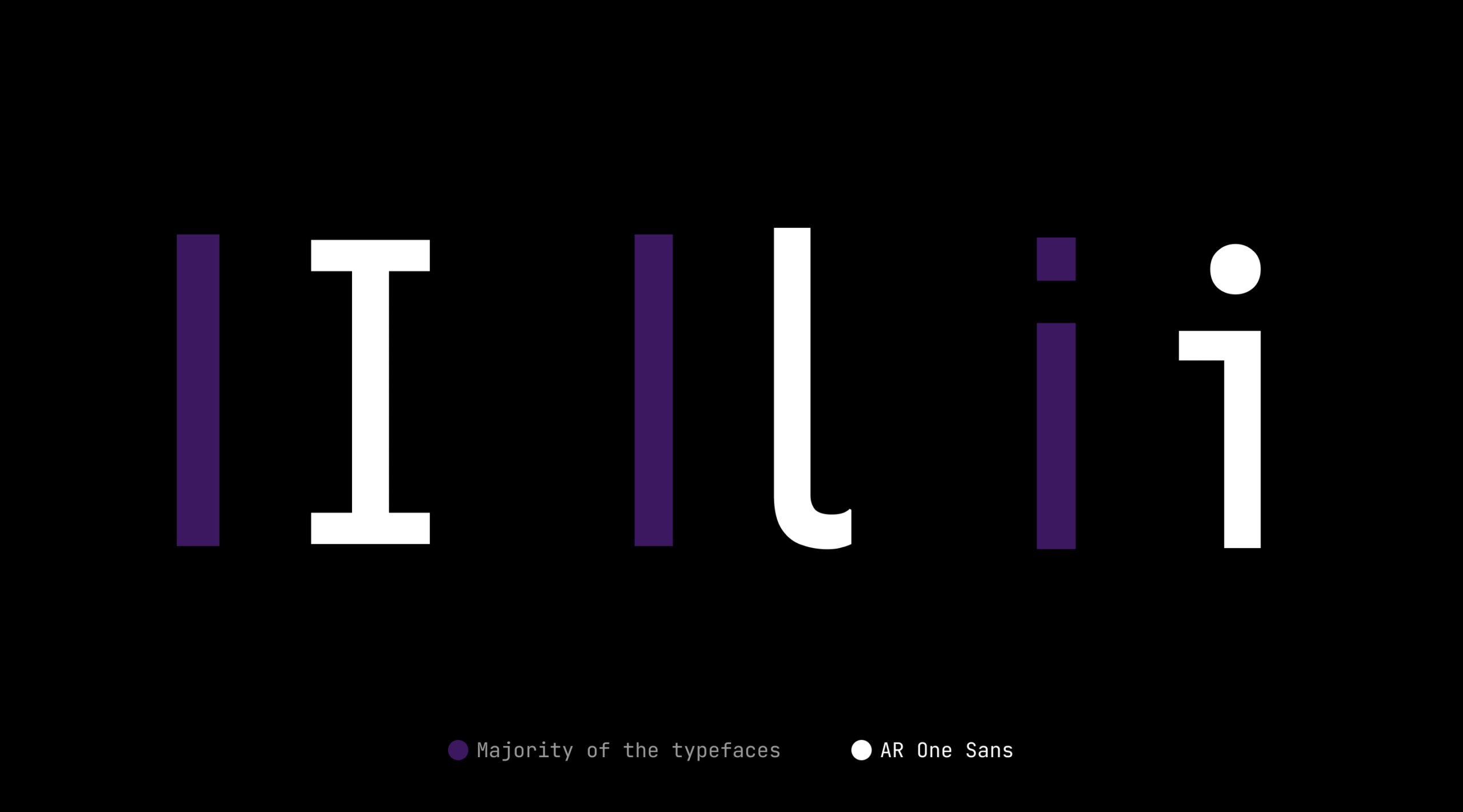
Each letter in AR One Sans is shaped to stay legible, even as resolution drops. By adding a subtle flare at the ends, the forms resist breaking apart when pixels blur or disappear. The outlines are drawn to avoid confusion between similar letters, so the “I” and “l” are never mistaken for one another, and even the humble “i” gets a distinct ear. These small choices add up, reducing the risk of misreading in environments where every detail matters.
Spacing designed for headsets
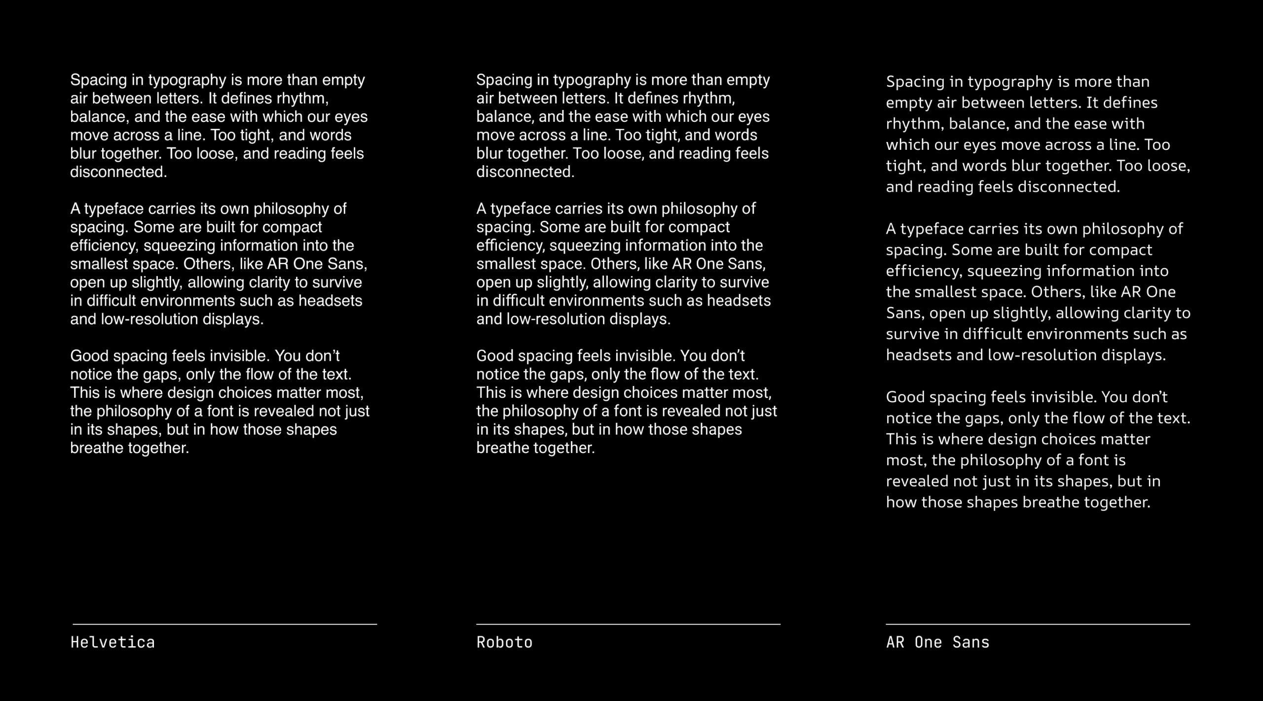
In AR, text often blooms, glows, or softens at the edges. AR One Sans has extra spacing built in so letters don’t collapse into each other.
The “Marionette formula”
Instead of relying on perfectly smooth curves, some shapes use strategic straight cuts. It sounds counterintuitive, but at low resolutions, these cuts actually look smoother than literal curves due to the limited number of pixels and halation. It’s a trick borrowed from the history of type design that still works beautifully today.
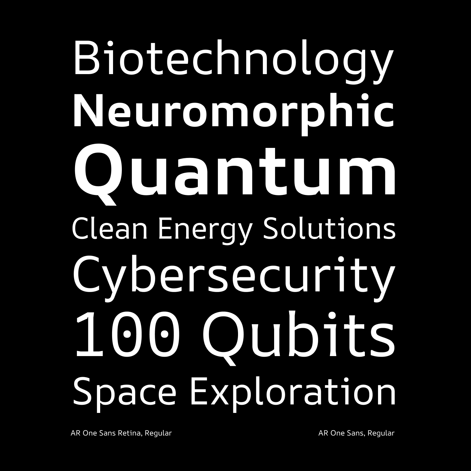
Made for long-form reading
Most UI fonts are optimised for short labels and buttons. AR One Sans is comfortable at scale; subtitles, captions, even longer passages of text in immersive spaces.
How to use it
Retina vs Standard
If you’re working on high-ppi displays, use the retina version. For older or lower-end devices, stick with the standard.
A small note: if you’re pulling AR One Sans directly from Google Fonts, you’ll only find the standard version there. For mobile and desktop apps, I recommend the retina version unless you specifically need to support legacy hardware. The retina version is available as a variable font with ARRR axes, or you can download the files directly from this link.
When using outside AR
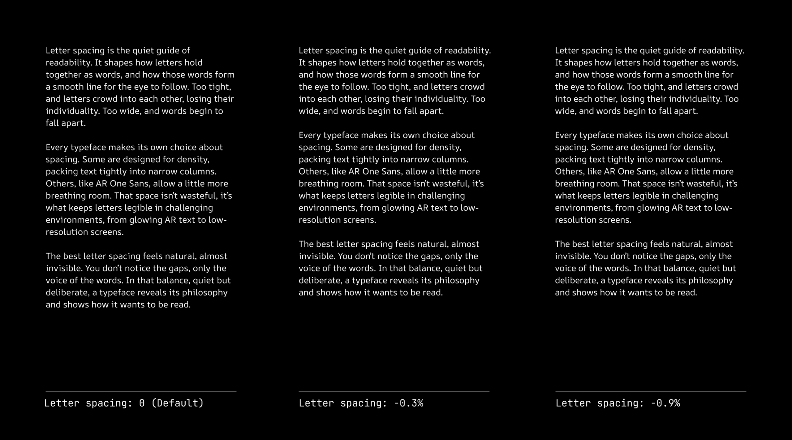
On desktop or mobile apps, the spacing can feel too loose. That’s because the font was optimised for negative polarity (light text on dark backgrounds) and the distortions of AR headsets. To make it fit naturally in a standard UI, just tighten it with negative tracking between -0.3% and -0.8% (recommended), but you can try what works for your use case. That small tweak makes a big difference.
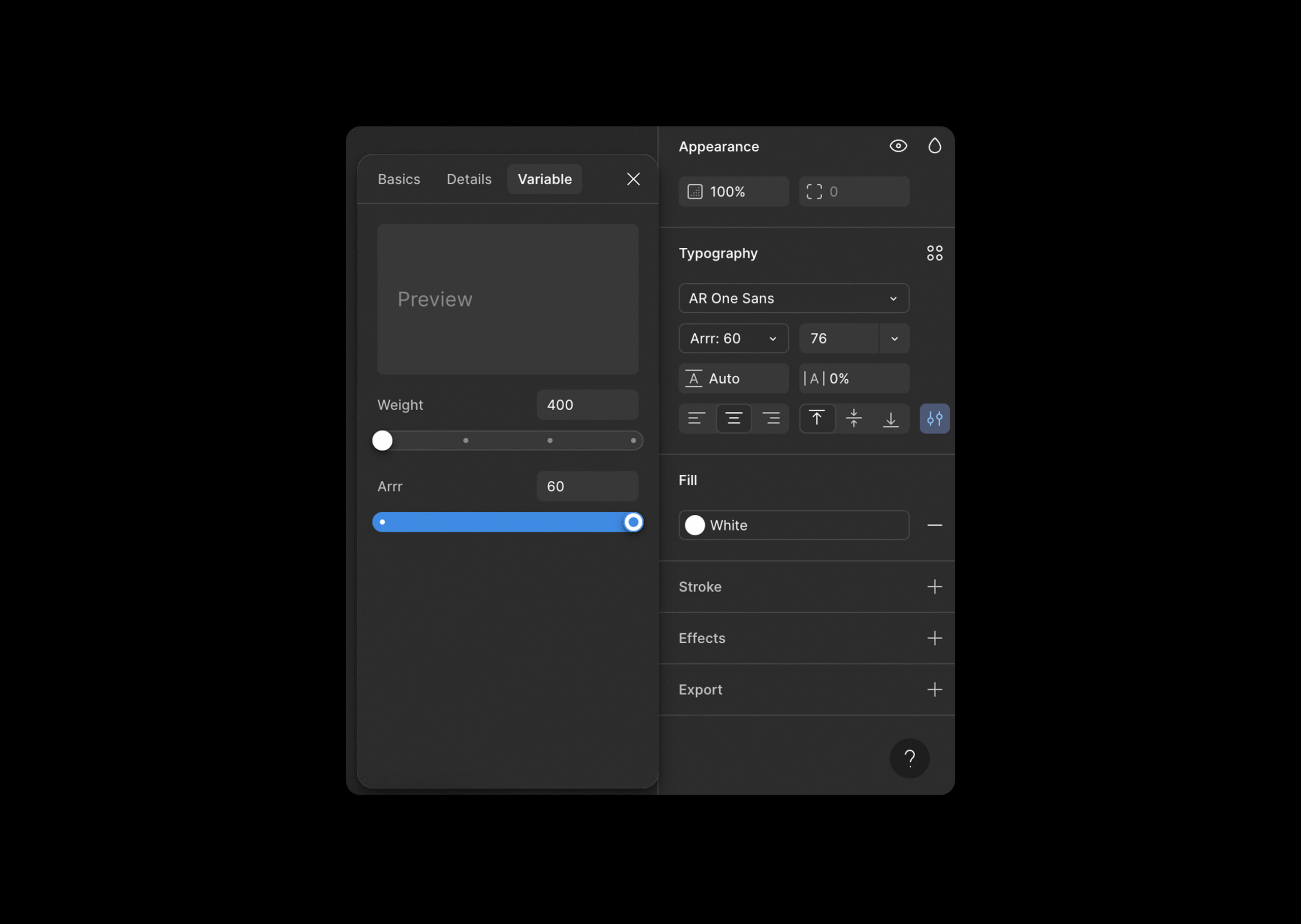
ARRR axis (Augmented Reality Retinal Resolution)
This is the real secret sauce. The ARRR axis lets AR One Sans adapt its shapes to the resolution of the display.
- On low-res headsets, the letters open up, reinforce their strokes, and increase x-height for clarity.
- On high-resolution displays, the letterforms settle into a more refined, precise shape. The font is designed to adapt, whether it’s facing the sharp clarity of a retina screen or the rough edges of a low-res headset. Thanks to its variable properties, AR One Sans isn’t locked to a single future. It’s ready for whatever display conditions come next, from the best you can build for the most challenging you might come across.
A few features that make it work
- Flaring at stroke ends to counteract missing pixels at low resolutions. This keeps strokes from looking chopped or uneven.
- Light traps at stroke intersections to minimise the glow or blur that often distorts letters in AR.
- Reinforced terminals so endings don’t fade out or disappear when rendered on weaker displays.
- Larger x-height in low resolutions so counters and apertures stay open and readable, even when there’s a halo of glow around the text.
Why it matters
AR One Sans isn’t trying to be a generic “tech font.” It’s designed for a specific challenge: making text feel trustworthy, legible, and adaptable in environments that are constantly shifting.
If you’re building for AR or VR, it gives you a foundation you don’t have to second-guess. And even if you’re designing for mobile or desktop, AR One Sans works surprisingly well once you adjust the spacing.
It’s a typeface that grows with the devices around it.
Download AR One Sans (Retina Version)
Download from Google Fonts (Standard Version)
Looking Ahead
AR One Sans is one step toward a larger question: what does typography look like when it’s no longer bound to flat screens? In spatial environments, type isn’t just information on a surface, it’s something that shares space with the body, with movement, with light.
We’ll need typefaces that adapt, that flex across generations of devices, and that feel as natural to read in a headset as they do on a phone. AR One Sans is designed with that future in mind, not as the final answer, but as an open invitation for designers, developers, and researchers to experiment, refine, and push typography forward.
If you’re building the next layer of digital experiences, I’d be curious to see how AR One Sans performs in your work. And if you’re an AR or VR developer interested in refining the reading experience in your projects, feel free to reach out, I’m always open to a conversation about what’s possible.
Every project is a chance to learn more about what makes reading in these new environments feel seamless and human.