In the last article, we discussed variables that affect the overall experience in AR, now let’s have a look at specific factors that influence the reading experience while using AR headsets.
We are in the early stages of crafting immersive augmented reality (AR) experiences and new ways to interact with elements in space. The amount of text in most of the current scenarios is limited to a few strings or short extracts of text. However, as we move towards mainstream usage and the amount of text will rise exponentially. Some of you might argue that the voice user interface is the next big thing but take the simplest of apps on your phone and imagine using it in AR. Even simple apps have a few text elements which allow us to quickly scan the different possibilities in a single go which is impossible to replicate in a voice user interface unless you have trained yourself for superhuman selective listening power. So, let’s spend some time understanding what are the key factors that impact our reading experience in AR.
1. Visual Acuity
Reading is a highly visual task that requires rapid and accurate translation from orthography to phonology. If the reader is unable to perceive the letters clearly, then the reading experience will suffer. The reading performance depends on the visual acuity, and clarity of vision which is dependent on optical and neural factors like the sharpness of focus within the eye, the sensitivity of nervous elements and the interpretative ability of the brain. Ophthalmologists use the ability to see and read small letters at a distance, as a clinical method for measuring the visual function which is usually expressed in a fraction of 6/6 (or 20/20) which means the viewer can read at a distance of 6 meters (20 feet). (this video explains it well)
Visual acuity produced by AR headsets can be calculated based on pixels per degree. It is the number of pixels per degree it present to the eye, the number of pixels in the horizontal display line has to be divided by the horizontal field of view provided by the optics of the headset (lens) 1. E.g. In a display with 1280 x 800 px, the pixels per eye are 640 x 800 px, and with a FOV of 90 degrees the PPD comes out to be 7.1 (640/90). This is way too low as compared to the retina resolution of the eye, the PPD of the human fovea is approximately 60 PPD. A lower pixel density can cause blurring of text, pixelation and the screen door effect (the visible fine lines between pixels on a display when seen up close). Assuming the optics are perfect, the current headsets are in the range of 20/80 which is low in comparison to a human eye. Additionally, the magnification of the optics (in some cases) is never perfect, so there is a reduction in actual PPD which further reduces the acuity.
2. Spatial frequency
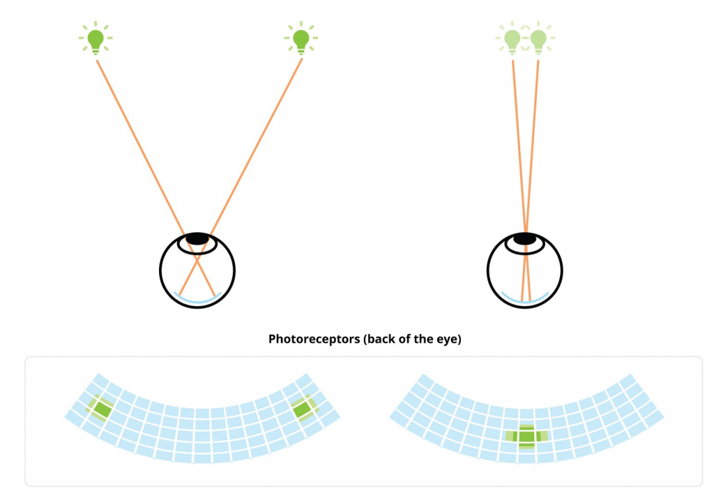
When a person looks at two lights shining at a distance, he can distinguish between them because the light from each source travels through the eye and hits a different set of light-sensitive cells (photoreceptors). Once the light moves closer to each other, they hit the photoreceptors in proximity (see figure 1), and beyond a certain distance, the brain is unable to distinguish between and starts to interpret them as one light source. The angle between those two rays of light at a which person loses the ability to distinguish between the two lights is 1/60th of a degree, also known as one arc minute; it plays a major role in understanding spatial frequency.
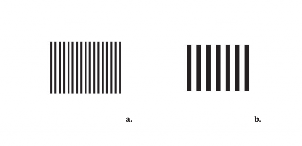
Spatial frequency refers to the level of details present in an image (stimulus) per degree of visual angle. A letter with small details and sharp edges contains higher spatial frequency as compared to a simplified letter with round edges. It is expressed in the number of cycles of alternating dark and light bars (the black and white parts of the letter in case of type) per degree of visual angle also known as “cpd”. Humans can perceive a maximum of 60 cycles per degree(cpd) and information beyond that limit is filtered out.
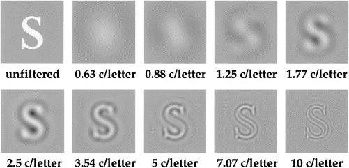
The visual angle becomes smaller with the increase in the distance, moving away from a particular image increases the high spatial frequency content. It has a direct impact on text viewed at a distance, once the distance increases the spatial frequency of the text increases with it and once it reaches above 60 cpd, the brain starts to filter out the high-frequency elements like serifs, sharp edges and corners.
3. Crowding
According to Flom 2 crowding is the effect of separation which hinders the reading, it is a perceptual phenomenon in which recognition of letters presented away from the fovea (centre of gaze) is impaired by the presence of neighbouring letters (see figure 4). Crowding is affected by contour interaction that involves spatial interference and lateral masking (inability to perceive identical or similar objects in proximity).
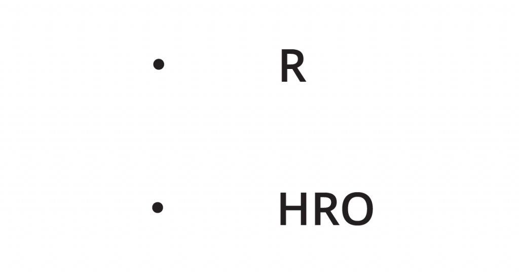
As stated by Hughes 3, the spacing of letters not only affects how easily they may be seen, it also affects their apparent size. Skottun and Freeman 4 studied the spacing between letters and their apparent size in relation to acuity and found that the perceived size of widely spaced letters appeared to be larger than the closely spaced letters of the same size. They suggested that the reason is related to a lateral masking effect, letters that are uncrowded appear clearer and thus may also appear to be larger. In AR text is usually at a distance of at least a meter away and crowding can have a negative impact on the reading experience, especially in the case of large blocks of text.
4. Foveal and parafoveal reading
Human eyes do not move continuously along a line of text while reading; instead, they jump across the line in rapid movements (known as saccades), between these saccades the eyes stop for a fraction of seconds (fixations).

In the retina, the fovea is a central pit composed of tightly packed cones in the eye which are responsible for the sharp central vision also known as foveal vision. The distance the eye moves in each saccade is between 1–20 characters with the average being 7–9 characters. The saccades last for 20–40ms, and during this time the vision is suppressed, and no new information is acquired.
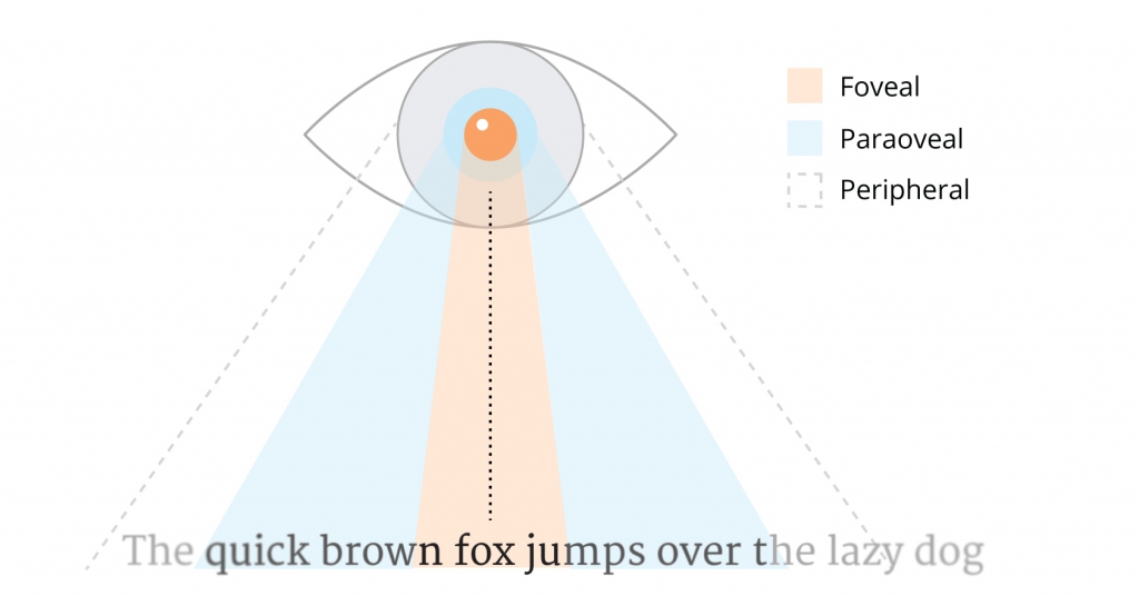
According to studies along with the foveal area, the parafoveal area also has a vital role in continuous reading. O’Regan 5 in his study stated that the next word influences the length of saccades: longer words result in longer saccades and short words have short saccades. Thus it can be said that the parafoveal region plays a critical role in continuous reading and should be taken into account while designing typefaces to be used in AR applications for longer text settings.
Conclusion
These factors discussed above are not something new in terms of observation but now we have a different set of challenges to improve future AR experiences. According to me, this gives us an opportunity to redefine the whole reading experience and how it is delivered. In future posts, I will share more about how I’m planning to do this…
Endnotes
- Understanding Pixel Density & Retinal Resolution, and Why It’s Important for AR/VR Headsets, https://www.roadtovr.com/understanding-pixel-density-retinal-resolution-and-why-its-important-for-vr-and-ar-headsets/
- M.C. Flom. Contour interaction and crowding, Problems in Optometry, 1991, 3(2), cited in L. E. Hughes, and A. J. Wilkins, Reading at a distance: Implications for the design of text in children’s big books. British Journal of Educational Psychology, 72, 2002, p. 214.
- E. Hughes, and A. J. Wilkins, Reading at a distance: Implications for the design of text in children’s big books. British Journal of Educational Psychology, 72, 2002, pp. 215.
- B.C. Skottun and R. D. Freeman, Perceived size of letters depends on inter-letter spacing: A new visual illusion, Vision Research, 23(1), 1983
- K. O’Regan, Moment to Moment Control of Eye Saccades as a Function of Textual Parameters in Reading, cited in A. Kolers, M.E. Wrolstad & H. Bouma, (eds), Processing of Visible Language, New York: Plenum Press, 1979, pp. 49–60.
