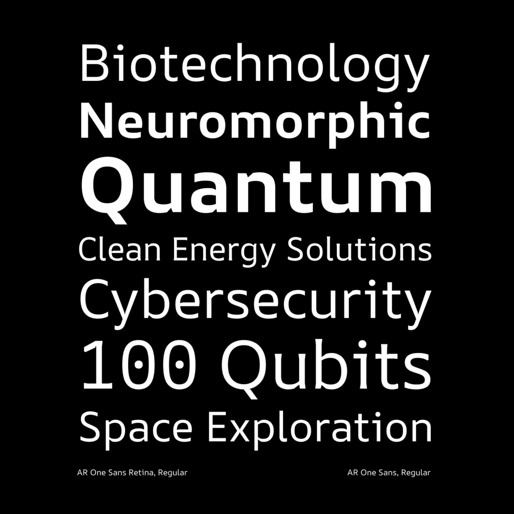
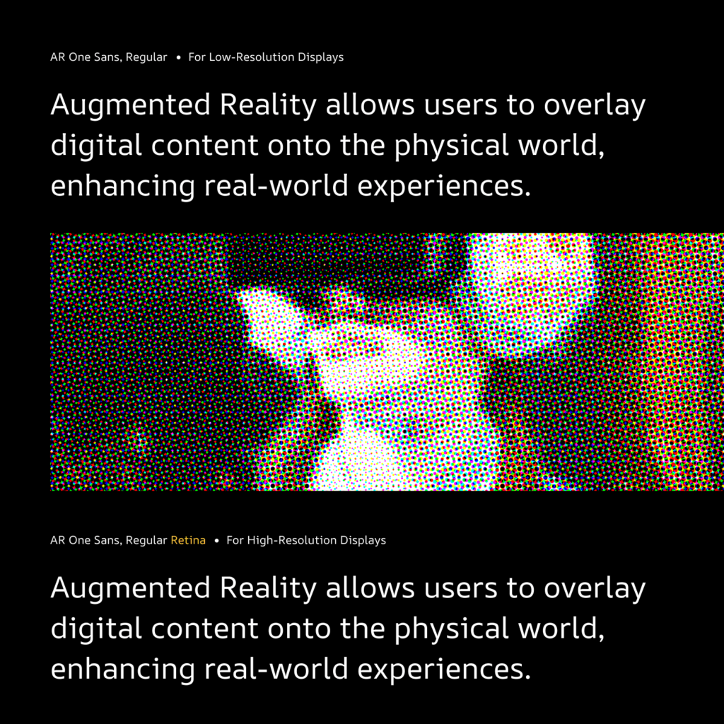
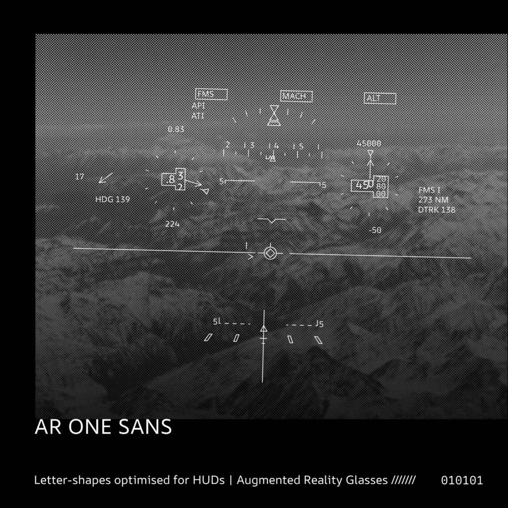
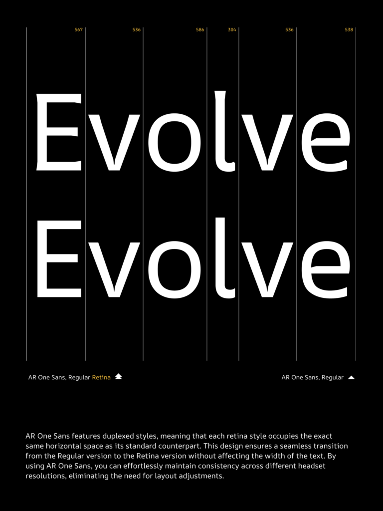
The AR One Sans type family is for use in augmented reality environments and user interfaces. Its low contrast, generous spacing and robust shapes make it work well in busy backgrounds with high readability. The design of letterforms is based on ongoing research and thorough testing on various devices ranging from high-end headsets to low-resolution smartphone-based devices. It has optical weights for high and low-resolution duplexed to avoid text reflow, making it easy to deliver a seamless user experience across platforms/devices. The functionality of the text has been tested thoroughly to make the reading experience better even in longer texts.
Context
The rapid evolution of technology has prompted the type industry to consistently produce typefaces that are optimized for various environments and devices. AR One Sans is a font family that is specifically designed to support augmented and virtual reality environments, helping a wide range of users overcome technical limitations by providing a better reading experience. The font is not limited to AR and VR applications, and can also be used in contexts such as automobile dashboards, signage, and mobile applications.
Design Features
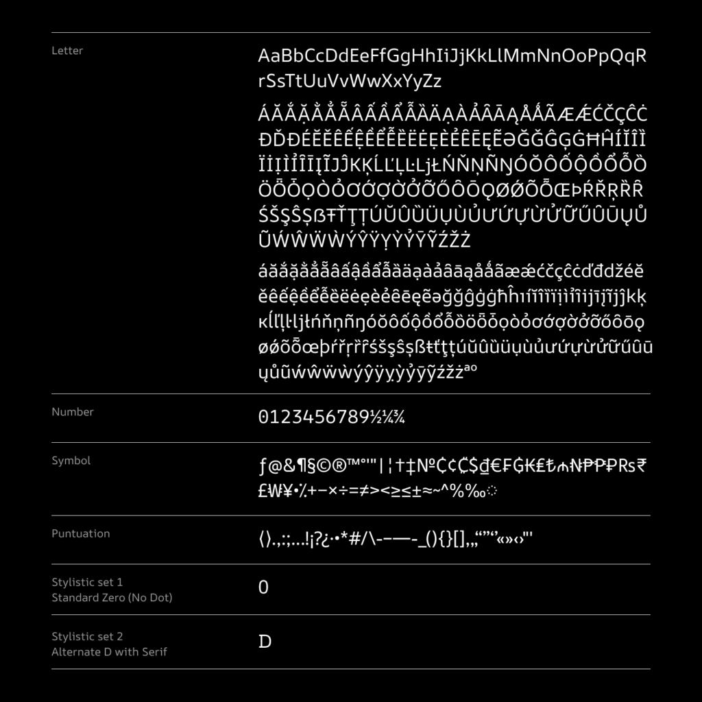
The design of the letterforms in AR One Sans is based on research and testing on a range of devices, from high-end headsets to low-resolution smartphone screens. This ensures that the font is able to withstand resolution and response time limitations, providing a consistently legible and user-friendly experience. The typeface uses the “Marionette formula,” a design concept introduced by William A. Dwiggins. This formula substitutes straight lines for curves in certain letterforms, creating the illusion of more graceful curvature than is possible with actual curves. To achieve this effect, the typeface’s cuts utilize the excess glow around the text to produce a smooth curve, resulting in letters with a more traditional shape, rather than those composed entirely of straight lines. The design is tested to improve the reading experience even in longer paragraphs, beyond small UI text strings. The letterforms are highly legible in low resolution because of extra pixels at the endings which counteracts the effect of rounding. And have distinct shapes to avoid confusion between commonly misrecognized letters. Eg: zero with a dot, curved bottom l, I with horizontal strokes at the top and bottom. The spacing and width of letters are optimized for negative polarity (light text on dark background) and angular distortion. The shapes are compatible with anti-interference techniques, which are recommended by researchers for better readability in AR environments. Specific design features have been added to reduce the effect of halation, and pixel loss in the lower resolution which causes the stroke ends to appear rounded.
The scalability of the AR One Sans font family across different resolutions makes it an ideal choice not just for current-generation headsets, but also for future headsets. The font is also developed with a complex script in mind and has the ability to accommodate a wider design vocabulary (coming soon).