
This is an early critique based on Snap’s announcement, the AWE 2026 demos and the information the company has shared publicly. Specs doesn’t ship until autumn, so some of these observations will inevitably change once the hardware is in people’s hands. But the interesting part is that many of the biggest typographic questions are already visible. They’re baked into the assumptions behind the platform, not hidden in the implementation. Read the earlier breakdown of Meta’s display glasses here.
Snap has built something genuinely exciting. Unlike Meta’s display, which sits off to one side like a heads-up display, Specs puts digital information directly into the world. Labels can live on the objects they describe. A translated street sign can stay attached to the sign itself. A document can exist at the depth of an actual wall instead of inside a floating window.
That’s a much bigger leap than adding another screen to your face. It’s also why typography suddenly becomes one of the hardest problems in AR.
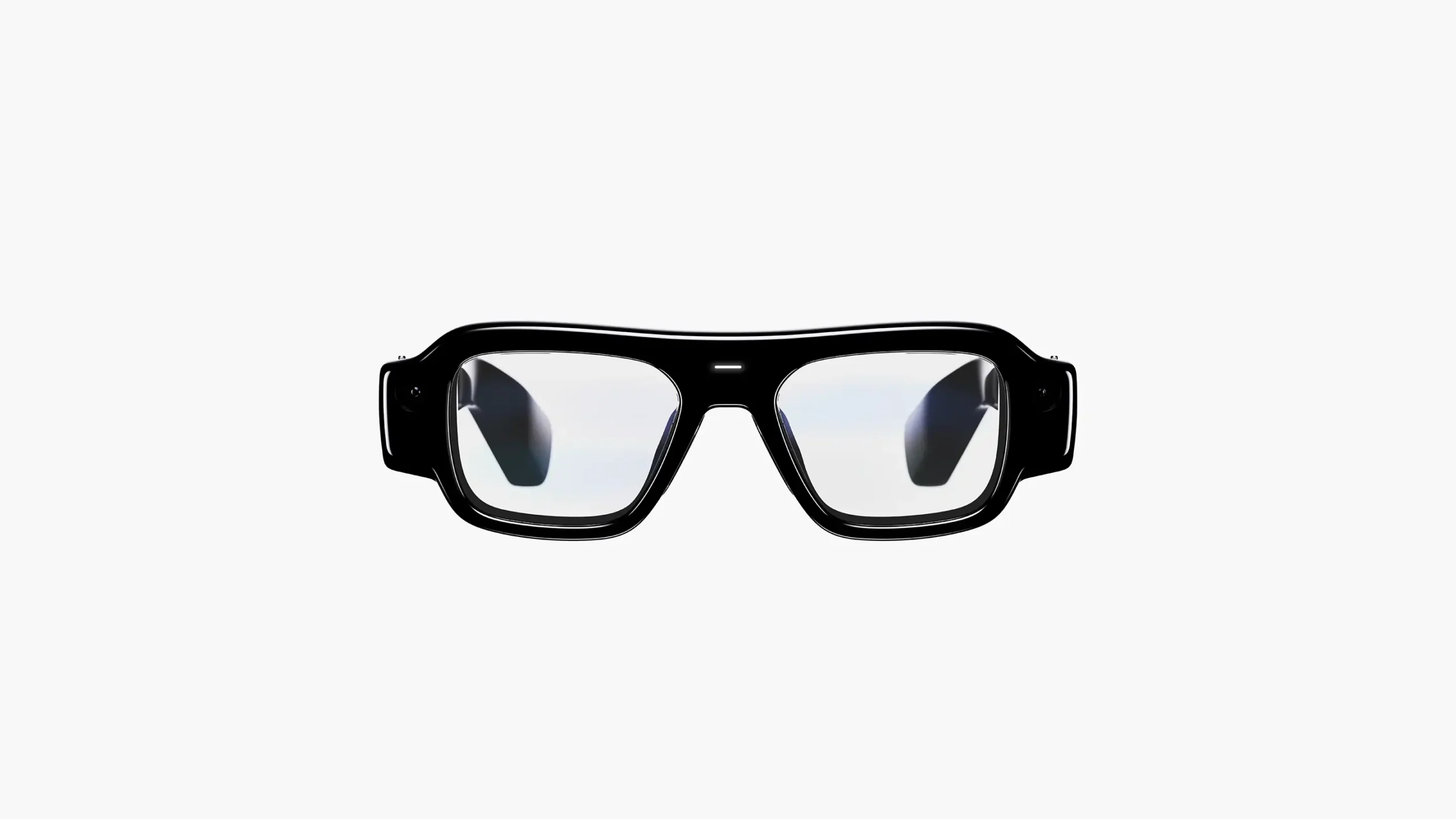
Reading isn’t just another feature on Specs. It’s the foundation of almost everything Snap showed. Email. The web. Translation. Virtual monitors. If people can’t comfortably read in these environments, the rest of the experience starts to fall apart.
This isn’t a review of the hardware. Fitting true stereoscopic AR into a 132-gram frame is a remarkable engineering achievement. The questions here are typographic. More importantly, they’re systemic. They’re the kinds of assumptions that won’t stop with Snap. They’ll likely shape every Android XR device that follows. Three things stood out to me.
Additive light has no black
For hundreds of years, reading has relied on one assumption that we rarely think about. The marks are darker than the surface beneath them. Ink absorbs light. Paper reflects it. Every convention in typography, from stroke weight to contrast to figure and ground, quietly depends on that relationship.
A see-through display breaks that assumption. Unlike a page, it can’t subtract light. It can only add more of it. True black isn’t something the display can render. It’s simply the display being transparent. That means the familiar model of dark text on a light background no longer exists. Instead, glowing letters sit on top of whatever happens to be behind them. A face. A building. A passing car. A bright afternoon sky.
The page disappears. The world becomes the page.
Snap’s answer is its electrochromic lens. It’s an impressive piece of engineering and it helps, but it solves a different problem. It darkens the entire world equally. Reading doesn’t need everything to become darker. It needs the space behind the text to become predictable. Those aren’t the same thing. Read against a dark wall and a paragraph feels solid. Turn towards a bright window halfway through the sentence and the exact same text starts disappearing.
At that point, the typography stops doing the work. The reader starts compensating instead. The challenge for AR isn’t recreating the page. It’s inventing a new figure-ground relationship that responds to the world behind every block of text.
A reading plane your eyes have to find
Moving text into the world changes more than where it appears. It changes how your eyes read it. Meta’s display lives in one eye. Snap renders to both, which is a major improvement. But stereo introduces its own challenge. Every piece of text now exists at a depth. Your eyes have to converge on that depth while the optics keep focus fixed elsewhere. Those two systems no longer agree. The result is vergence-accommodation conflict, one of the best understood sources of visual fatigue in stereoscopic displays.
For a quick notification, you probably won’t notice it. For reading an email or a document over several minutes, you almost certainly will. The problem gets harder once text is attached to the real world.
A label inherits the depth of the object it’s attached to. A translated menu sits at the depth and angle of the menu itself. As you move, every line changes size, perspective and viewing distance.
On a page, typography controls point size. In AR, point size becomes a consequence of where you’re standing. That’s a completely different design problem. A reading system built for AR would recognise that depth, slant and distance are typographic variables. Longer passages would stay on comfortable reading planes instead of being rigidly glued to physical surfaces. Text would subtly adapt as the viewing angle changes rather than expecting your eyes to do all the work.
So far, there’s little evidence of that thinking. Instead, text seems to be placed wherever the application wants it. The visual system is left to cope.
Calling them Specs without giving the specs
There’s an irony here that’s hard to ignore. Snap has built a product called Specs while withholding many of the specifications that matter most for reading. We know the display has a 51-degree diagonal field of view. We know it can produce sixteen million colours. But Snap hasn’t disclosed the resolution, the horizontal field of view or the aspect ratio.
Those aren’t minor omissions. They’re the numbers that determine whether reading is actually comfortable. Take line length. One of the strongest predictors of reading comfort is measure, the number of characters your eyes travel before returning to the next line. You can’t design measure without knowing the horizontal extent of the display.
Instead, Snap compares the experience to working on a twenty-four-inch monitor or watching a 115-inch cinema screen. Those analogies sound impressive. They don’t tell us whether text will actually read well. Resolution matters even more. The previous generation of Spectacles delivered around 37 pixels per degree. Comfortable reading starts much closer to 60. The new display offers a wider field of view, which means pixel density only improves if the underlying panel resolution increases proportionally.
Without those numbers, nobody can know. At lower angular resolutions, typography begins to fall apart. Hairlines disappear. Counters start filling in. The differences between weights become increasingly difficult to perceive. This is exactly the class of problem optical sizing was invented to solve. It’s also one of the motivations behind AR One Sans, which adapts its shapes for lower retinal resolutions.
But you can’t design for an optical system whose optics remain undisclosed. Marketing comparisons don’t replace specifications, especially when the product is being positioned as a reading device.
A fourth problem, briefly
The three issues above are platform problems. This one becomes an ecosystem problem. Snap already has hundreds of Lenses placing text into space. Soon there will be thousands.
Yet there’s no shared typographic system for spatial interfaces. No guidance for type size across viewing distances. No rules for adapting contrast. No measure. No optical sizing. No spatial equivalents of the design tokens we’ve spent years refining for screens.
Every developer ends up solving readability from scratch. Most won’t solve it well. There’s another assumption hiding underneath all of this. Specs launches first in the US, the UK and France.
That’s three Latin-script markets. The moment these ideas reach Devanagari, Arabic or CJK scripts, entirely new problems appear. Line heights change. Character density changes. Connected scripts behave differently. Vertical stacking introduces new constraints.
Spatial typography isn’t just about depth. It’s also about language.
Where this leaves us
None of these problems diminishes what Snap has achieved. Building lightweight consumer AR glasses that can anchor digital information into the real world is a remarkable milestone. But it also marks the beginning of a different typographic era. For five hundred years we’ve learned how text behaves on paper. Over the last few decades we’ve learned how it behaves on screens. Now we’re asking it to live inside the physical world itself.
That isn’t just another display problem. It’s an entirely new medium. The question isn’t whether text can exist in space. Snap has shown that it can.
The harder question is what typography has to become once it leaves the page behind.