For decades, digital typography assumed a stable relationship between text, screen and reader. The screen might become larger, smaller, brighter or sharper, but the basic condition remained unchanged. Text lived on a surface and the reader looked at it. Glasses change this relationship entirely. Text no longer sits on a screen. It exists alongside the world itself.
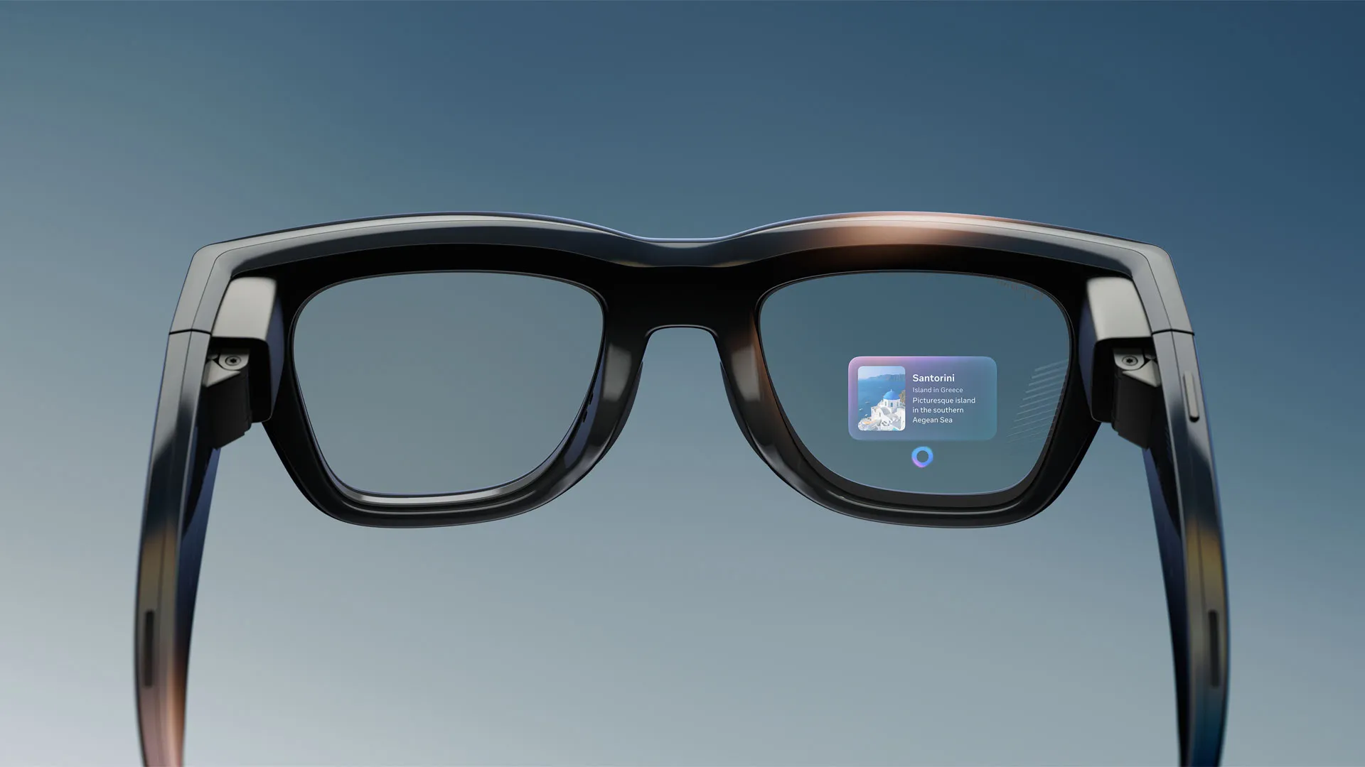
The latest Meta Ray-Ban display makes this shift visible. Live captions, translation, message previews and AI responses transform the glasses into a reading device worn on the face. Strip away the camera and the AI layer and what remains is a system for placing language directly inside everyday vision. The hardware itself is genuinely impressive. The 5,000 nit display solves a problem that has limited head-mounted displays for years: sunlight legibility. For the first time, outdoor text on glasses feels plausible. Yet the typography still behaves as though it belongs to a phone.
This is not a hardware critique. The display is a 600 × 600 full-colour panel positioned in the lower-right portion of the right lens, offering a 20-degree field of view, running at 90Hz for motion and 30Hz for static content. It appears roughly equivalent to a paperback held at arm’s length and is visible to only one eye. The failures described below are typographic and systemic. They can be fixed in software, which also means they can easily become defaults that spread across Android XR devices shipping over the next few years.
1. Sustained reading on a monocular display
The first mistake is treating a glanceable interface and a reading surface as the same thing. The display exists only in the right eye while the left eye remains optically clear. For notifications this works surprisingly well. A message appears, attention shifts briefly and returns to the world. The interaction lasts only a few seconds and the visual system comfortably tolerates brief monocular input.
Live captions are fundamentally different. Captions require sustained reading, often for the duration of an entire conversation. One eye receives bright rendered text while the other receives the unobstructed world. The visual system must constantly negotiate between these competing sources of information. Over time this creates a low-grade form of binocular rivalry in which the brain alternates between suppressing one channel and the other. The eye strain and fatigue reported by many early reviewers may partly be physical, but some portion of it is likely perceptual.
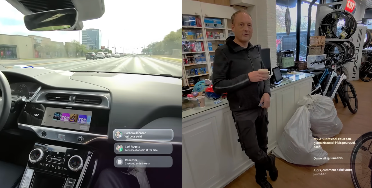
The typographic consequence is that duration disappears from the design system. Type that has been optimised for a two-second glance is being used for twenty minutes of reading. Message previews and rolling caption streams share the same size, weight, spacing and density. Yet reading duration is a first-order variable on glasses in the same way that viewing distance is a first-order variable in signage or wayfinding. A notification and a caption stream should not share the same specification. Reading mode and glance mode require different typography.
2. Captions rendered as chat rather than speech
The second mistake is applying messaging typography to temporal text. The caption system behaves much like a chat interface. Words appear, lines move upward and older content disappears. But speech is not chat. Conversation arrives unevenly. People pause, restart sentences, change words and correct themselves. Modern transcription systems frequently revise words after they have already appeared.
Reflow during reading is one of the most disruptive events the eye can experience. The saccadic system plans future eye movements based on expected word locations. When text moves during reading, these plans become invalid. The result is friction that feels subtle but accumulates over time.
There is a deeper conflict as well. Captions exist so people can continue looking at one another during conversation. Yet the text sits in the lower-right region of the visual field, forcing constant shifts between the speaker’s face and the words themselves. Typography could mediate this tension but currently does very little. Stable text and provisional text appear identical. Older text carries the same visual importance as newer text. Lines are not chunked into stable reading units and there is little indication of where the present moment exists within the stream.
Broadcast subtitling research solved many of these problems decades ago. Stable line breaks, two-line limits, clause-based chunking and fixed positioning all reduce reading effort. Very little of this knowledge appears to have crossed into spatial interfaces. Temporal text requires its own typographic grammar, one that distinguishes stable from provisional, present from past and conversation from messaging.
3. A fixed rendering system for an unfixed world
The third mistake is assuming that text exists against a stable background. At approximately 30 pixels per degree, the display provides roughly half the angular resolution typically associated with comfortable print reading. Thin strokes begin to disappear, counters begin to close and distinctions between adjacent weights become increasingly difficult to perceive.
The fonts currently used appear largely inherited from high-density phone displays. Yet low-resolution optical conditions require different drawings. Larger x-heights, more open apertures, sturdier strokes and optical sizes designed specifically for reduced resolution become increasingly important. That adpation doesn’t exist right now.
The problem becomes more complicated because the background itself constantly changes. Unlike a phone, the display sits on top of the world. Against a dark environment, the text appears heavier and may bloom. Against the bright sky, it appears thinner. Simply increasing brightness does not solve this because perceived stroke thickness changes with luminance.
The proper response is typographic rather than purely optical. Variable grades, adaptive weights and responsive rendering could maintain perceived stroke thickness as environmental conditions change. A display capable of producing 5,000 nits already possesses the dynamic range necessary to support this behaviour. What is missing is the typographic system that sits above it. On a see-through display, the environment becomes part of the typography itself. Rendering that ignores the background is effectively rendering for a screen that no longer exists.
A fourth problem: the script ceiling
The current translation system largely operates within Latin scripts. English, Spanish, French and Italian fit comfortably within assumptions developed through decades of Western interface design. The moment these systems move into India, Japan, the Middle East or other multilingual contexts, many of these assumptions begin to fail.
Devanagari occupies greater vertical space. Arabic depends on connected forms. CJK scripts introduce significantly higher visual density. Line heights, caption chunking, spacing behaviour and weight decisions built around Latin typography may not survive this transition. The challenge is not merely translation. It is whether the underlying typographic model itself can travel across scripts.
What this makes clear
Three structural failures become visible within a single evening of observation on one of the most advanced consumer text displays currently available. None of them requires new hardware. All of them require a deeper understanding of how typography behaves away from screens and within changing environments.
Many of these assumptions will likely travel into Android XR devices arriving from Google, Samsung, Xreal, Warby Parker and other manufacturers because they inherit the same interface conventions and the same typographic defaults. The opportunity at the moment is not simply to design text for glasses. It is to recognise that reading itself has moved into a new medium.
The question these devices pose is not whether AI can place text in front of our eyes. That problem has largely been solved. The more interesting question is what happens when reading leaves the screen and enters the world itself, and whether we are designing for the display or for the eye that must read it.