Before we start talking about Typography in Augmented Reality (AR). Let’s understand what is it? AR is an enhanced version of a real-world environment wherein the real world is “augmented” by computer-generated perceptual information that can include multiple senses. On the contrary, virtual reality (VR) replaces the real world with a computer-generated environment. People often get confused between these two however, Milgram and Kishino’s reality-virtuality (RV) continuum (figure 1) makes it easy to understand and clarifies some of the boundaries that define AR. According to the RV continuum, AR is a part of the general area of mixed reality (MR).
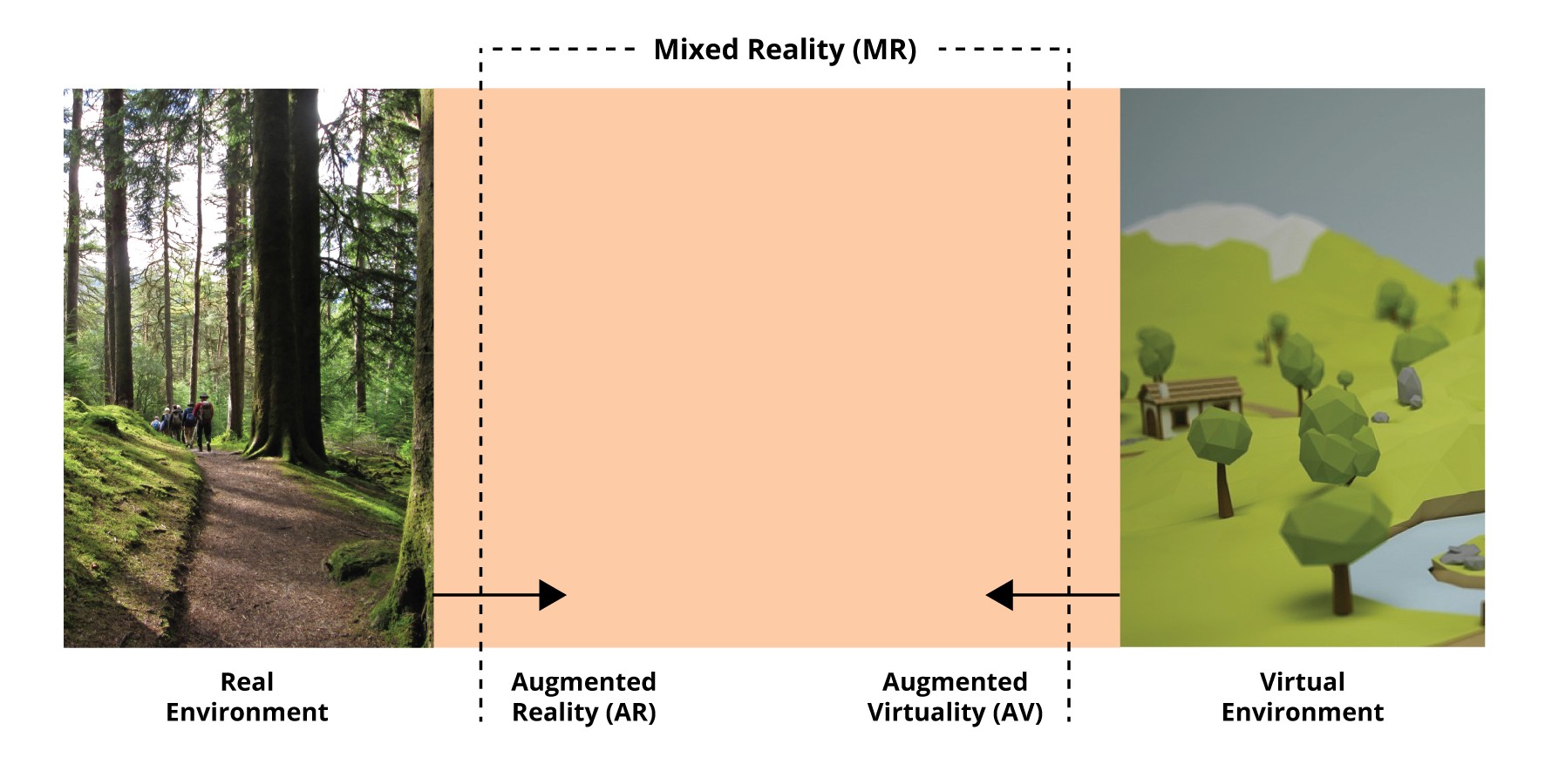
The left part of the continuum defines the environment consisting of real objects we see through our naked eyes or some sort of video display. The right part of the environment consists of only virtual objects which can be computer-generated simulations, either on-screen or an immersive display. Within these boundaries, the mixed reality environment is defined as one in which the real world and virtual world objects are presented together within a single display. The augmented virtuality in the continuum refers to the scenario where real objects can be mapped as part of the virtual environment (world). For example, a user’s hand can be introduced (augmented) in the virtual world in order to perform physical actions such as grabbing objects or manipulating the virtual scene.
There is also a general misconception that a visual combination of virtual and real elements using special effects in sci-fi movies is AR. Even though computer graphic techniques are used in AR, the distinguishing factor is real-time processing and interactivity. To clarify the scope of augmented reality Azuma defined characteristics; (i) it combines the real and virtual world, (ii) it is interactive in real-time, and (iii) it is registered in 3D (aligns real and virtual objects with each other). In general terms, it can be said that Augmented Reality is an extension of the real world where interactive computer-generated graphics are projected in real-time and are aligned in space in relation to the real world.
Time to clear your doubts!
The majority of people are sceptical about the success of AR considering the failure of consumer products like Google Glass back in 2012. But the fact is Google glass barely scratched the surface of AR capabilities and it was not just the privacy issues that made it hard to sell but also the other factors like price vs utility. Saying that it failed is not true since it is now it is being utilised across industries to boost the productivity of workers. It was the demo of what AR is capable of, now that devices like Hololens, Daqri, Meta etc. have been there in the market for a couple of years and they steadily making their way out of niche domains like military applications, industrial maintenance, construction to mass-market applications in educational institutions, museums etc. and most interesting, spatial computing. This is a good sign for the growth of the technology since these key areas fuel the research and investment which will act as a catalyst to bring these devices into the mass consumer market.
No new technology grows in a flash and considering complex technology like AR, the current growth is quite commendable and it shows that AR is more than a fad. The investments in AR/VR have been scaling up fast and the spending is expected to cross $215 billion by 2021. Apple’s entry into AR and rumoured glasses (patents) have sparked the interest of a lot of people and investors worldwide. Taking a closer look at the recent company acquisitions and hiring by Apple signals something is secretly cooking inside in the area of AR.
Why you should care?
Magic Leap was founded in 2010 and has been one of the most highly guarded secret startups that raised $1.4 billion from a list of investors including Google and China’s Alibaba Group. It has shipped its first headset this June targeted toward developers and creators. So, what is so special about them for designers (especially Type Designers)? They have a custom typeface named LominoUI specifically designed for Magic leap.
Going through their typography guidelines and design of the type family which includes desktop and app versions, it seems a lot of effort has been put into it. At this moment I can’t comment on the reading experience since the typefaces for AR are very hard to judge just by looking at them on traditional screens (I am still waiting to get my hands on the headset). But the point I am trying to make is that the companies know the potential impact of typefaces hence they are shelling out money to provide better a user experience for their users.
On the other hand, Microsoft’s Hololens is still sticking to its Segoe UI family and it is planning to launch a new version of Hololens which is expected to release later this year. I hope that they are working on some new typefaces since the Segoe family works okay, however, certain aspects in the design of letters need to be fixed that are affected by rounding at the stroke endings which is a problem for text in AR.
As already mentioned earlier, AR devices are being used in critical domains such as industrial maintenance, construction, military hardware and medical applications. All these are highly sensitive areas where slight errors can be life-threatening especially, considering the users who represent a wide range of age groups. Earlier, designers tried to use the least amount of text possible, but the complexity of information is growing, and the need for text is rising with it. This shift towards text-rich interfaces makes it essential to focus on legibility, readability and overall implementation of typefaces in AR.
Typefaces for augmented reality
Type design for the screen has continuously been evolving since the introduction of CRTs in the 1960s, competing with printed text in terms of quality. Meanwhile, the display technologies have transitioned from bulky desktops to mobile devices and now to wearables such as smartwatches. The shift of data consumption from traditional desktops to handheld devices and wearables suggests that we are stepping into a new era of the digital age and AR headsets show a promising future. Throughout the evolution of screens, new typefaces have been designed and released to provide the best possible experience.
Before I jump to discussing the need for AR specific typefaces, I will share the common question that people ask me when I tell them that I am working and researching on typefaces for AR. “Can’t we use existing typefaces in AR?” Well, of course, you can, just like you can use any book typeface for user interfaces!
Every medium has its specialities and limitations which require adjustments and a different design approach and AR is no different instead, it introduces several new variables that have not been touched before (which will be discussed later in the series).
We all live in the time of retina displays but what happens when you see your screen using a magnifying glass? Well, this is the case in AR headsets seeing that same retina screen a few inches away from your retina (I mean eyes!) using a magnifying glass (optical elements to be precise). Hopefully, now you can imagine the difference between regular displays and AR displays. The effect of this display mechanism results in issues like distortion, chromatic aberration etc (I will explain this in detail in upcoming articles).
However, let’s discuss the non-technical challenges. The major hurdle in using text in AR is the unpredictable backgrounds that change based on users’ surroundings and affect the legibility which is more prominent while using it outdoors. A series of studies conducted by Gabbard et al and Fiorentino et al in an industrial context tested variables like text style (background of text), colour coding and illumination. Their findings suggest the use of white text in billboard style (a rectangular block behind the text) works well in a variety of conditions and also pointed out the positive impact of using a thin outline around the typefaces for better contrast. Another study revealed the relationship between type size and contrast threshold; the smaller text requires higher contrast between text and the background for acceptable readability.
The existing studies focus only on the display of text and its relationship with the background noise. There is no research available on structural aspects of the text hence I spent the last year studying and researching about the text in AR while pursuing my MA in Typeface Design at the Department of Typography & Graphic Communication, University of Reading.
Just to give a brief idea about what make typefaces for AR special. They are to be designed keeping in mind the principles of both text typefaces (intended to be used in small sizes) and signage typefaces!
What’s next?
In the upcoming articles, I will share about various aspects of text and typefaces in AR, covering the need for typefaces, displays and perception, the current state of the text in AR, setting a design/testing workflow, design considerations and challenges to be solved in AR through type design and typography.