
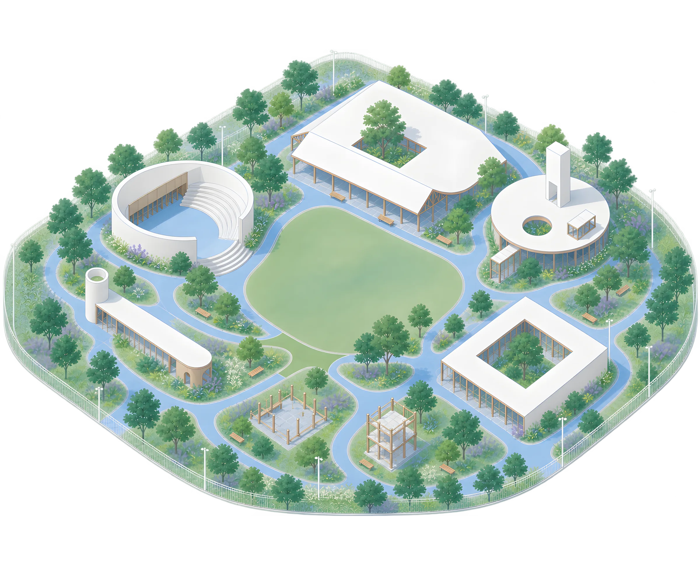


Every new computing platform changes how we read
Books gave information a page.
Screens made it interactive.
Phones made it portable.
Spatial computing is beginning to place it inside the world around us.
AI may change not only where information appears, but how it responds to each person.
MY WORK IS AN ONGOING ATTEMPT TO UNDERSTAND THESE SHIFTS BEFORE THEY BECOME INVISIBLE PARTS OF EVERYDAY LIFE.
The Journal is where the thinking becomes visible. Some entries are essays. Some are notes. Some are ideas still forming. Together, they trace the research behind the work.
Niteesh Yadav’s 4 part series on typography for AR is now the standard on the topic.
New concepts need clear explanations. Mixed reality is upon us and these guidelines from Niteesh make plain some of the key challenges that lay ahead for text — from technical details to reading experiences.

Led the redesign of Pocket FM from the ground up, building a scalable product experience for global audiences. We developed a design system rooted in Pocket FM’s audio DNA, drawing from spectrograms and the history of audio equipment to create a visual language for sound. The work brought together accessibility, scale and emotional expression across the product.
AR One Sans is one expression of a broader research question: how does reading change when text moves beyond the page and into space?
It's the first open source typeface family designed for augmented and virtual reality headsets. Crafted for clarity in complex environments, it features generous spacing, low contrast and sturdy forms for optimal readability. Developed through extensive research and testing, it includes optical weights tailored for both high-end headsets and low-resolution devices, ensuring seamless, reflow-free reading across platforms.
Design is not about decoration. It's about
making things clearer and simpler.
Because how something feels isn't the
opposite of function, it's a part of it.
I design to make sense of the world.
Sometimes that's through screens, spatial, or
sensory system. But always shaped by the
context they live in and the people they serve.
Typography has always grounded my practice.
It shows how the smallest details can shift how
AR or VR, across scripts and languages, it's how
we connect. It's not just letters, it's access.
I'm not here to follow standard templates.
I'd rather dig deeper. Questioning what's
considered 'good enough' to build for unseen
users, people with different abilities and contexts.
Each project is a chance to invent what's missing.
I see technology as a medium, not the message.
AI, sensors, variable fonts, only matter
when used with purpose. To build something
that responds to how humans actually live.
I'm drawn to thoughtful, quiet ideas.
In a world racing ahead, it's not to be part
of it, but to notice, refine and build with
respect.
Good design is generous.
It invites collaboration, sharing tools,
mentoring new designers, creating spaces where
I care about the people making the work.
And underneath all of it, my purpose is simple:
To use design with intent. To shape how we read,
hear, touch and navigate the future.
This is my way of leaving things better.
SUBSCRIBE TO THE UPDATES
Occasional notes on typography, interfaces, spatial computing and the future of reading.